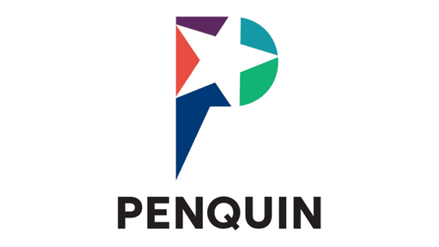
Johannesburg’s Penquin, a leading brand communication agency, has unveiled a bold new logo and refreshed corporate identity that aims to embody the company’s innovative spirit and strategic vision.
The rebranding marks a significant milestone for the creative firm, reflecting its commitment to delivering solutions that keep clients competitive and relevant amid rapid changes in the marketing landscape.
“Our rebrand represents more than a visual transformation; it signifies our dedication to inspiring awesome, together, pushing our brand’s presence further into the world with renewed vigor and purpose,” Ryan Nofal, managing director of Penquin, told reporters at the launch event.
At the core of Penquin’s rebrand is a new logo inspired by the stars — specifically Sirius, the brightest star visible from Johannesburg’s skies. The five-pointed star motif represents the agency’s core brand values: boldness, creativity, purposefulness, accountability, and innovation.
“The star motif in our new logo signifies our guiding light in the vast advertising universe,” Nofal explained. “The open design elements and the strategic tilt correlating with Sirius’s declination are nods to our openness to fresh ideas and our rootedness in Johannesburg.”
Long recognized for its ability to craft compelling brand narratives and generate impactful cross-channel ideas, Penquin hopes its revitalised identity will reinforce its position as an industry leader. The changes go beyond mere cosmetics, according to the firm, aligning seamlessly with its strategic direction and core principles.
“This rebrand…is a declaration of our commitment to not just keeping pace with the industry but setting the standards for creativity, innovation, and excellence,” Nofal stated.


